Introduction to the design process
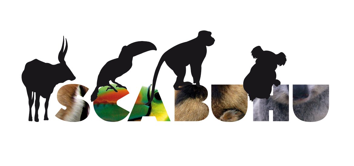
SCABUHU is a way of perceiving the environment, of using all the life-experiences to let them play a role in design. SCABUHU is a collective of people that likes to enjoy what they do, that likes to have fun and on top that loves design. SCABUHU sees communication as an exchange of perspectives, as a way of thinking where just half of the work is the one made by the designer, the user/perceiver is our 50% of the group and thus we always try to step in our audience shoes when designing. SCABUHU uses everything around as a source of inspiration. SCABUHU reads blogs, news, art galleries and scientific papers. SCABUHU wants you to participate because we love people and by reading this you are now 50% of our group. Welcome to SCABUHU way of thinking.


Defining our design process is a hard task, the group is formed by 4 people and each one by his own has a particular design point of view and way of making. However, that is the best thing of the team. We consider ourselves lucky of counting with a photo, type, composition and creativity expert. Thus, when working in our group, the most remarkable phases of the process are always related to the requirements, specifications and problem definition where each of our experts has his opportunity to let the rest know about his perspective and to learn from each other. After this it is easier to understand how essential is brainstorming for us, because that is the moment in which each of us brings gray mass to the table and that is the moment in which things happen.
We wanted to point out some quotes and references to the subject’s reader (Visual Thinking For Design, Colin Ware, 2008) that helped us to understand how our own system works and that bought to us some light to understand the pleasure of working with flexible minds that are able of combining not just one method, but mixing several of them to make Design gain interest, joy and consistency:
Problem definition
“The aim is to understand and define a problem before attempting to solve it.” (p.157)
“Calatrava is an accomplished artist with a fine sense of line and texture, but one senses that his graphical output is never the result of a wish to produce a drawing but rather to understand a problem . ” (Colin Ware)
Sketching and thinking
“ Tasks include reasoning about affordances for walking along paths and over lawns, the need for patio space and flower beds. Visual queries relating to walking or strolling will be best supported by a design allowing for paths, lawns, and patios to be perceivable as visual gestalt through the careful use of color, texture, or line.” (P.158)
“A designer may easily produce twenty or thirty sketches to find the solutions to various problems and retain only one.” (P.160)
“There are two kinds of preliminary design artifacts that we have been considering and each involves different forms of meta-seeing. The first, the concept diagram, is about design concepts and usually has little in common with the appearance of any physical object. An example of this would be Darwin ’ s sketch of the evolutionary tree. The second is the prototype design which is a rough version of a final product. Many of the most interesting diagrams are combinations of the two.” (P.161)
“A concept sketch differs from a prototype sketch in that it is a method for constructing, organizing, and critiquing ideas. It provides abstract representations of ideas and idea structures. Most sketches are hybrids of prototype and concept sketches, partly appearance and partly ideas.(P.165)
Experiences and life
“The perceptual critique of a design prototype can be used for direct tests of how well the design will support cognitive tasks. These have to do with the perception of symbols, regions, and contours, and the details of this have been extensively covered in the previous chapters.; you must simulate in your own mind what other people will see when they view the finished product. This involves simulating the visual queries that another
person might wish to execute and asking of yourself questions” (P.163)
“The first is the fact that a line can represent many things because of the flexible interpretive pattern-finding capability of the visual system. The third is the critical cognitive skill of interpreting lines in different ways. A whole lifetime’s experience enriches a scribble and transforms it from a few meaningless marks to a thinking tool.” (p.165)
How the theory of visual perception is applied?
Shape perception
“(…) shape perception is based mainly on luminance channel information, color sequences that vary mainly in luminance will be the most effective in revealing patterns in the data. (…) Different colors in the sequence along with a color key makes for more accurate readings. The best solution may be to provide a sequence that spirals up through color space, starting off with a dark color and selecting a series of colors, each of which has higher luminance than the previous one.” (p.81)
We used luminance to highlight information about which route has to be chosen. We used it for the icons – by the closest icons remained in their original state, but if you moved further with your eyes the icons became more pastel.
Depth perception
“Because neither air nor water is completely transparent, the contrast between an object and its background is reduced as distance increases. (…) Designers can reduce contrast artificially to exaggerate atmospheric contrast and create an enhanced sense of depth. In addition, reducing contrast, like depth of focus or size scaling, can be used to direct attention away from less important objects.” (p.93)
We only used depth perception in our 3D map, by showing the icons in three dimensions. By the anaglyph technique we made the icons around the starting point bigger and in the end smaller.
Object perception
“Objects can be identified far more rapidly if they are presented in views that clearly reveal the connections between component parts. For this reason, in design, it is always a good idea to make the connection points between parts of objects as clear as possible.” (p.111)
For the museums we used a big M letter. This is not the icon that everybody used to, but still generates the perception of a museum. By using the green colour and changing the font we wanted to avoid the misunderstanding with a metro station.
The shops are a different piece of cake. Here we used the bag analogy and to make it more smooth with the entire map we made it by using type.
Gist and scene perception
“People can easily identify scenes, such as »a busy road«, »a rural landscape« or »a fast-food restaurant«, and they can make this kind of categorical judgment in less than a tenth of a second even if they have never seen that particular road, landscape, or restaurant before. This is about the same time it takes for a person to identify that an object is a person, a dog, a car or belonging to some generic class.” (p.112) “The rapid characterization of a scene is called getting its gist. Neither the generalized two-dimensional views theory nor the structured object recognition theory can account for why it is so rapid and efficient. Gist perception can, nevertheless, be thought of as another example of a process whereby patterns of patterns are the key.” (p.112)
The semiotics of the icons has been designed according to the meaning that they are referring to. All the icons are easily identifiable and using a simplify map it’s also helping to rapidly understand the situation.
Pattern perception
“Pattern perception is more than contours and regions. Groups of objects can form patterns based on the proximity of the elements.” (p.53)
“(…) studies of human pattern perception show that humans are much better at identifying objects when the viewpoint is a familiar one.” (p.108)
“The basis of visual thinking is pattern perception, not learned symbols.” (p.131)
The same icons in one place generate patterns, and if there are highlighted they are more visible and people want to follow that direction. The route itselft is also generating a pattern, a complex circle, but with the connection it is easily recognizable.
The Concepts
Posters:

After a brainstorming session we came up with some ideas we could follow in order to create and develop a coherent and finished the style of our group, our brand: SCABUHU. We thought, in all of the posters we create, there has to be something in common, something that makes them a whole. Considering this idea, the usage of the CMYK colour system was the logical step to take. Each of our posters followed one particular colour from the CMYK palette. Moreover, these colours have already contained an indication for different emotions. Instead of showing the most obvious objects – like train, tracks or the station – we decided to trigger pure emotions within the viewer.
The first poster we made is in cyan. The blue colour often represents the human emotion of sadness, e.g. "He was feeling blue". The main idea in the poster was that the hand has to represent the power of NS and has to indicate that nothing and no one can stop the ride of the company. A strong fist is shown in a blue font. The fist is hand drawn in an aggressive style exalting the pressing atmosphere of the conflict with the Spoorzone Delft. There is no written message in the poster that could lead the observer to the right direction of its meaning, because the observer has to understand it immediately. Unfortunately, most of the viewers have percept this fist, crashing the rails instead of a metaphor for an unstoppable powerful “train”. The conclusion is that the poster has ambiguous meaning and could be understood as negative and also as positive reaction to the constructions in Delft.
The ‘Delfty’ poster has been done with using magenta colour and the criteria used her is the third dimension technique. The 3D effect has been reached by using black shapes as train tracks.
When we did the brainstorming about the concepts we come up with an interesting idea that magenta colour is related to Barbie. It is interesting because it can combine basically two different ideas: criticism and conflict.
Barbie stands for criticism about the “ideal” body and the everyday fashion look. This gets related to extreme physiognomies, like fat or thin and every hard opinion related to it.
Taking into account the criticism mentioned above we decided to mix it with the conflict of the Spoorzone Delft. Using this combination we get a way richer aspect to communicate our message and make people reflect to it in an original way.
Furthermore the “extreme makeover” subtitle makes reference to the typical American television programs where people wish to change their life. This life changing is not a just a current modifying, this is an extreme one, a completely different angle that even revise the way to perceive things around. So this idea leads to take into account and help to communicate the fact of the construction of Spoorzone Delft might create controversy. The worries people already had will become a reality. A pretty clear way to connect these worries to Delft is the introduction of the Neuewe Kerk and the perspective of the railway entering inside.
The final question could look like this: Do you prefer to stay on the traditional way or change it for an ideal fashion makeover?
Under construction poster. The main color used there is yellow. The idea of the poster is to look like an attention sign and here we used vector figures in 2D. Using the visual narrative the poster tells a possible scenario that can happen to the citizens of Delft that is under construction now. The yellow color is appealing and grabs easily the attention of the viewer, plus the company with the black makes it the best colour contrast combination that can be spotted even in far distances. We played with typographical elements and simple silhouettes in order to communicate in a clear and narrative way to the perceiver.
The aim of the poster is to show the negative side effects of the Spoorzone Delft. Last but not least the black colour or the “connected” poster. In this poster we used the analogy of `Composition, structure and grouping in 2D`. The poster itself is in minimal style, concentrating on the picture of the two girls and the word `connected`. The picture – and the whole poster – is in black and white, and instead of using any colours, the size and the composition lead the viewer to understand it. The poster can be seen from a good side with the text and the connected girls, but also the other way around you can see rage in the expression of the ladies.
Assignment TwoCONCEPT EXPLANATION

The map uses the typography as a structural element. Thus, the basic map’s information, like the streets name will draw the street itself by its iteration. Besides, in order to help the user locating himself in the area, useful information like the notification of the main streets by their representation with caps, or the canals by the use of italic it’s given. The direction to address the user is also implied by the use of different typographic weights. Therefore, bold, roman, italic, small caps and caps among others features are performing an architectural role on behalf of the information clarity. In this project, typography means the essential bricks to build a city in as less use of elements as possible where the visitant will find his way.


The museums are symbolized with an “M” in capital letter, attached to it the name of the museums can be found. The shopping area is drawn by letters’ illustration, as it is also the case of the cafes and churches. All the elements follow the architectural role of the type as a unique and flexible to create resources and communicate.
Our concept is based on the static theory of movement of proximity and we will approach that with the 3D technique.
TESTING PROCEDURE
The testing procedure was already set up in the second assignment. It should be executed with 20 test persons that are not acquainted with Delft. Therefore the test should be done in another place like The Hague or Rotterdam.

The testing procedure is as follows:
First respondent
• Both map versions will be shown simultaneously to the respondent (show the maps only 10 seconds)? With the question: 'Do you see any conspicuous differences between these two maps'. The answer has to be yes or no. If the answer is yes, ask the respondent to name the differences.
• Now show the same respondent only one version of the map. Ask him the following question: 'You are going to visit Delft for shopping and visiting museums. Which route do you choose, route K or P?' The respondent shouldn't be aware that K stands for 'Museum route' and P for 'shopping route'.
Second respondent
The procedure is the same as with the first respondent with the difference that now the other map is shown and the question asked is 'You are going to visit Delft for visiting museums and shopping. Which route do you choose, route P or K?'
Limiting conditions
• The use of text on the map is not allowed, with the exception of names of buildings, museums, streets and squares (all in English).
• The use of de 'Route line' itself as indicator for direction is not allowed.
• The use of arrows or other arrowlike symbols as indicator for direction is not allowed.
• The names 'Museum route' and 'shopping route' should not be used on the map. You can refer to these routes by route K and route P.
• There will not be a key to symbols. All visual elements should speak for themselves.
• The subtle but effective differences have to be based on the theory presented in Colin Ware's book.
Otherwise all kinds of static visualizations are allowed.
20 users participate in the map testing. Among them 10 were interviewed for the map with the clockwise route and the other 10 were interviewed for the counter clock route. For the Counter clock route, eight out of ten users would choose the option the map was designed for. However, in the Clockwise map route, just six users out of ten would choose the route the map was designed for.
Even if in both cases the results are positive, and the way of displaying the visual information influenced in the users decision, there are some considerations to be taken in order to improve the results, and to gain accuracy in its effect. For doing it so, the comments of those users that noticed differences are gathered below:
‘the street is darker, bolder’, ‘there are more shops here, more things to do, I would go for this direction it seems more appealing’, ‘I want to go shopping, I would go for this one’.
Analysis of the chart:
The new typographic map got good results for most of the tested items. Users were influenced by the designers’ choice of elements and visual weights when asked for choosing a route. However, there were still some features to be improved like the role of the icons in the general view of the map and other communicational elements, apart form the type, playing a swaying task. The 3D test was, in general, also positive, but the test procedure gave to us some data-reliable troubles. Users were not keen to wear the required glasses to perceive the 3D effect on the map and tried to reply the interviewers questions by avoiding its use. This might biased the final result of the test, in a positive or negative way. That is why the 3D element is not included in our final proposal. We consider it is a powerful element that can be used in a really innovative, influential and appealing way, but to confirm this further research would be needed.
Besides, there are other considerations that must be taken into account:
- Personal preferences (clockwise is more extended than counter clock)
- Differences, the users noticed the difference of the bold type for the clockwise route more than for the counter clock. This might be related to the diagonal strong visual power, calling attention. That disappears in the second one, the users might miss it when forced to focus on the clockwise option.


